Power Analysis
Research Question
Let’s say we’re interested in studying the effect of meditation on well-being.
We want to test if people who meditate have different well-being scores than the non-meditating population.
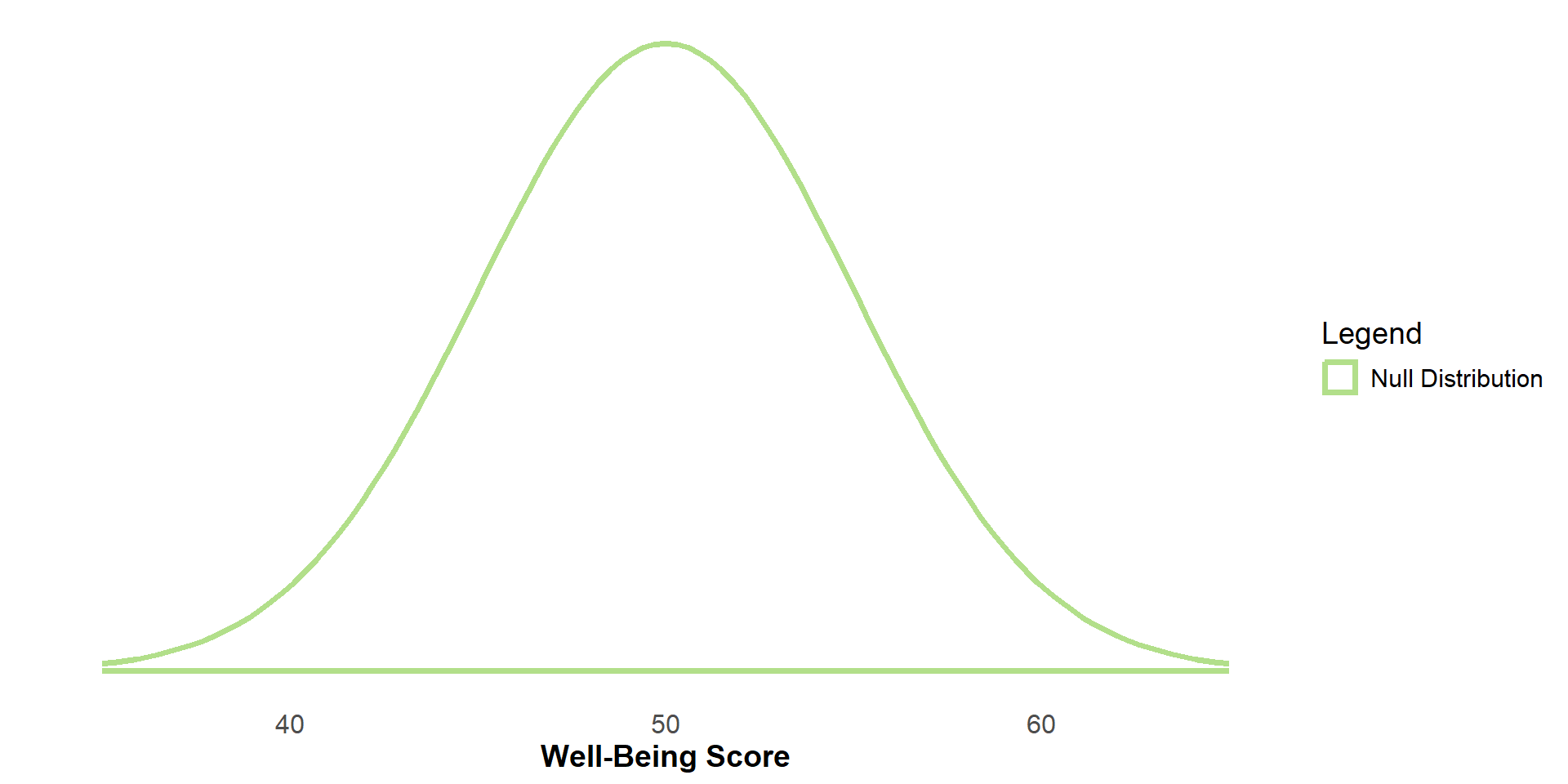
The Null Distribution
Let’s say this is the sampling distribution of the non-meditating population (the null sampling distribution) for n=15.
Let’s say this sampling distribution has a mean score of 50 and a standard error of 5.
The Null Distribution
If the null hypothesis (H0) were true (If meditation had no effect on well-being), the sampling distribution of the meditation (i.e. experimental) group would be identical to the non-meditation (i.e. control) group
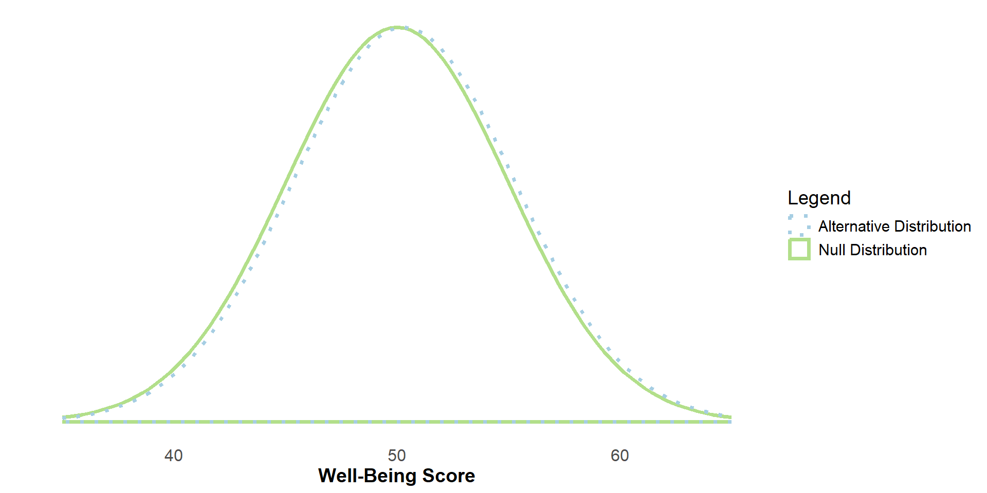
The Alternative Distribution
But, if the people who meditate have higher (or lower) well-being scores than the non-meditating population, then the alternative hypothesis (H1) would be true, and the two sampling distributions would be different.
H0: μMeditating = 0
H1: μMeditating ≠ 0
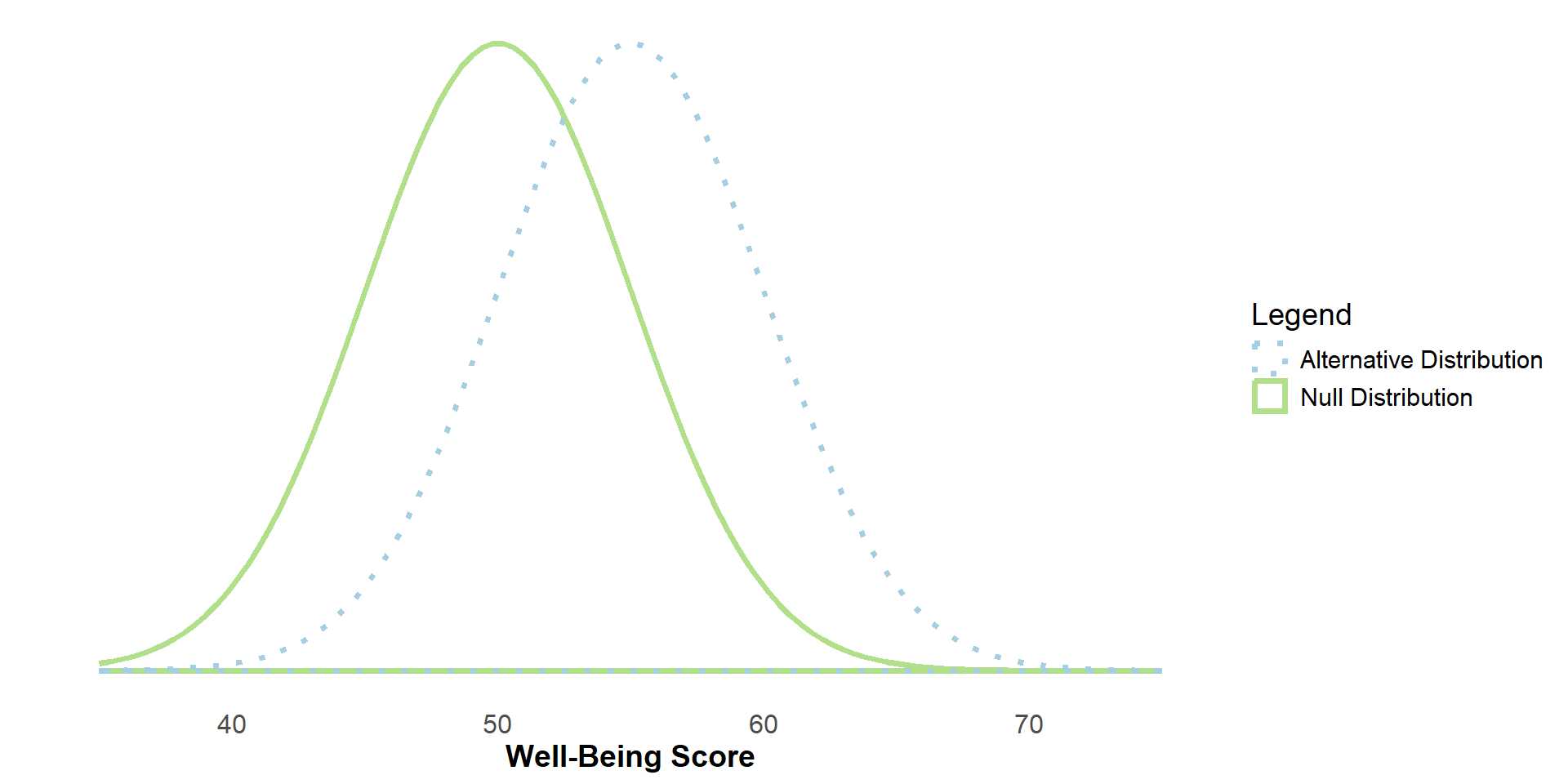
Sampling
Let’s say the population mean of the meditation (i.e. experimental) group is 5 points higher than the population mean of the non-meditating (i.e. control) group.
To reject H0, our sample mean would need to fall within the critical region of the null distribution (here, alpha=.05, two-tailed).
Sampling
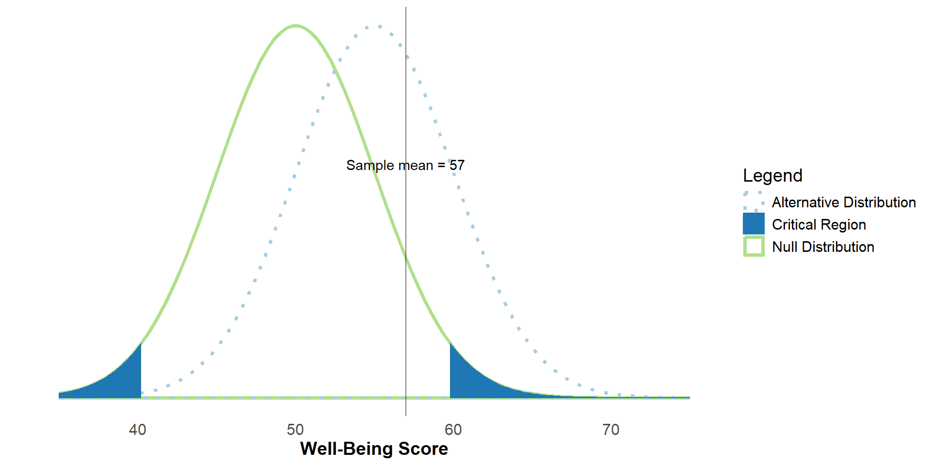
Let’s say we sample from the meditating population and get a sample mean of 57.
Sampling
In this case, our sample mean does not fall within the critical region of the null distribution, so we would fail to reject H0.
But, there is a true difference between the groups in the population.
This is an example of a false negative, or type II error.
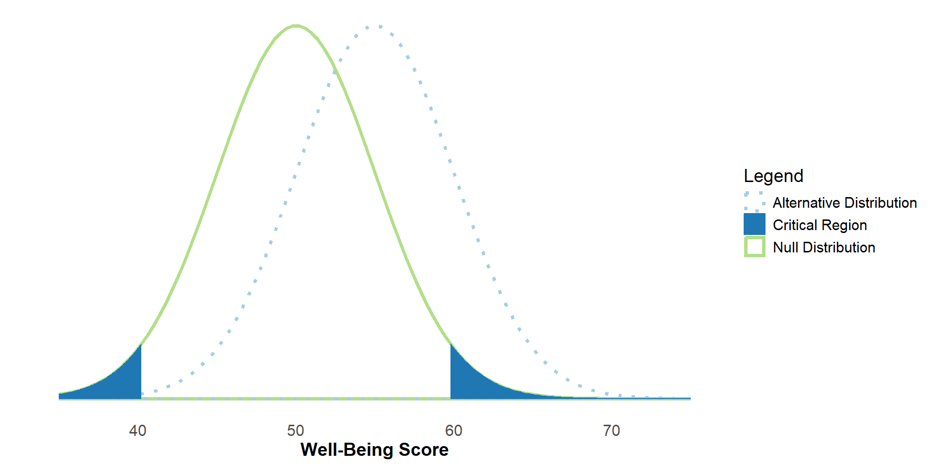
Statistical Power
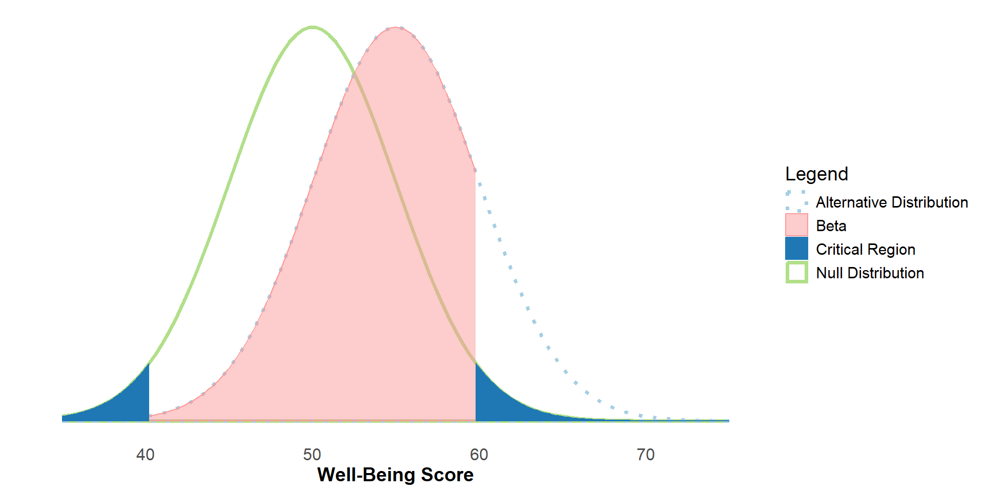
The region of the alternative distribution that overlaps with the non-critical region of the null distribution is beta (β).
Sometimes this is called the false negative rate, or the probability of getting a Type II error.
Statistical Power
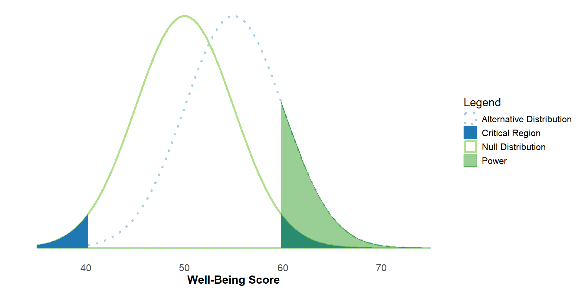
1 -β , then, is our statistical power. Sometimes it’s called the true positive rate.
We can think of it along of the lines of “if we sampled from the population, what’s the probability of us (correctly) rejecting H0?”
A Special Case: H0 is true
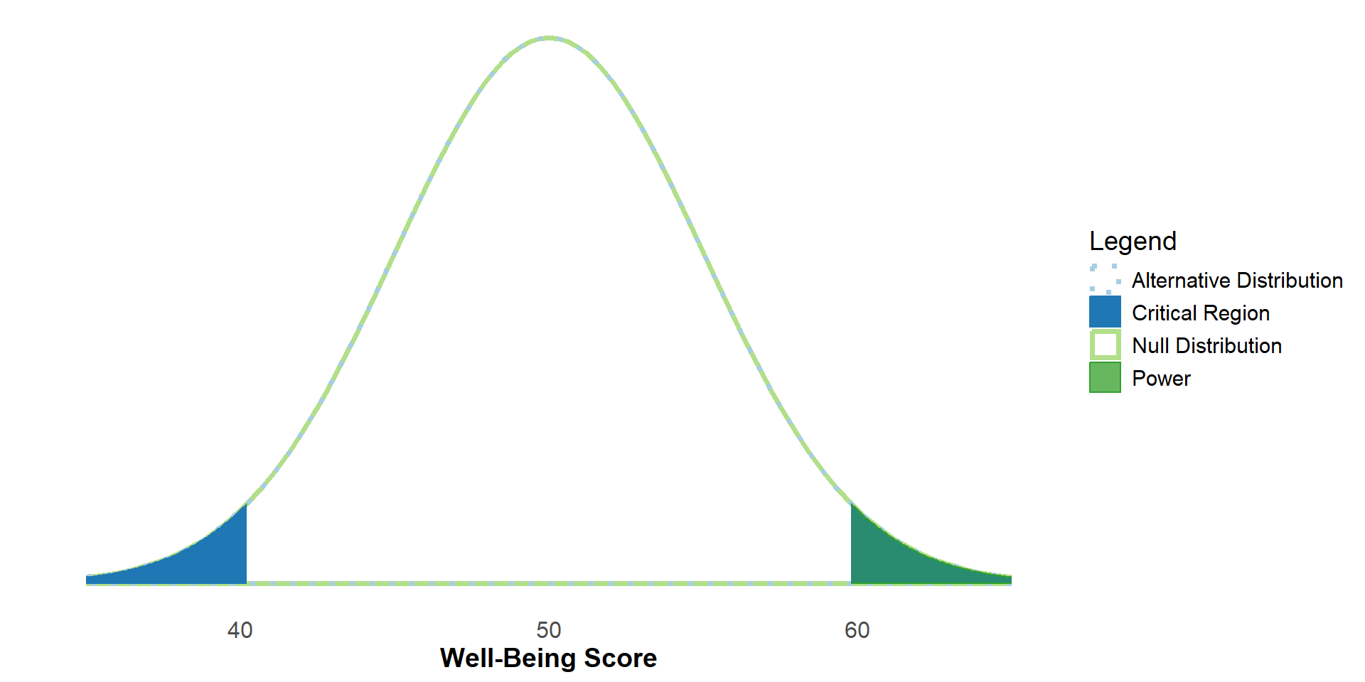
However, if H0 is true, then things change. We can’t correctly reject H0, but we can still get a significant result if our sample mean falls within the critical region.
This would be a false positive, or an incorrect rejection.
Because the size of the critical region is determined by α, we sometimes call α the False Positive Rate.
Possible Outcomes
Thus, we have 4 possible outcomes of a null-hypothesis significance test:
| H0 is True (in the Population) | H0 is False (In the population) | |
|---|---|---|
| Retain H0 | Correct Retention | False Negative (Type II Error) |
| Reject H0 | False Positive (Type I error) | Correct Rejection |
We can represent the probabilities of each of these outcomes with α and β
| H0 is True (in the Population) | H0 is False (In the population) | |
|---|---|---|
| Retain H0 | 1-α | β |
| Reject H0 | α | 1-β |
Two-Tailed Vs. One-Tailed
The prior examples were for a two-tailed test. What happens if we change to a one-tailed test?
#| '!! shinylive warning !!': |
#|   shinylive does not work in self-contained HTML documents.
#|   Please set `embed-resources: false` in your metadata.
#| standalone: true
#| panel: fill
#| fig-align: center
#| viewerHeight: 500

library(tibble)
library(munsell)
library(shiny)
library(ggplot2)
#library(plotly)

ui <- fluidPage(
  plotOutput("tailsPlot"),
  radioButtons("tails", "Tails:",
               c("2 Tails" = "twotail",
                 "1 Tail (Upper)" = "onetail_upper",
                 "1 Tail (Lower)" = "onetail_lower"), inline=T)
)

server <- function(input, output) {
  theme_minimalism <- function(){
    theme_minimal() + # ggplot's minimal theme hides many unnecessary features of plot
    theme(            # make modifications to the theme
      panel.grid.major.y=element_blank(),   # hide major grid for y axis
      panel.grid.minor.y=element_blank(),   # hide minor grid for y axis
      panel.grid.major.x=element_blank(),   # hide major grid for x axis
      panel.grid.minor.x=element_blank(),   # hide minor grid for x axis
      text=element_text(size=14),           # font aesthetics
      axis.text=element_text(size=12),
      axis.title=element_text(size=14,face="bold"))
  }

  output$tailsPlot <- renderPlot({
      lower <- -4
      upper <- 6
      alpha <- .05
      mu <- 3
      beta <- reactive({    switch(
      input$tails,
        "onetail_upper" = {pnorm(-qnorm(alpha,mean=mu))},
        "onetail_lower" = {pnorm(qnorm(alpha,mean=mu,lower.tail=F))},
        "twotail" = {pnorm(-qnorm(alpha/2,mean=mu)) - pnorm(qnorm(alpha/2,mean=-mu))})})
      power <- (1-beta())

      plt <- ggplot(data=data.frame(x=c(lower,upper)),aes(x)) +
        #The true sampling distribution
        stat_function(fun=dnorm,
                      args=list(mean=mu, sd=1),
                      geom="area",
                      linetype="dotted",
                      size=1.25,
                      fill=NA,
                      color="#a6cee3",
                      xlim=c(lower,upper))+
        #The null distribution
        stat_function(fun=dnorm,
                      args=list(mean=0, sd=1),
                      geom="area",
                      linetype="solid",
                      fill=NA,
                      size=1.25,
                      color="#b2df8a",
                      xlim=c(lower,upper))+
        #Displays the (upper) critical region of the null distribution
        stat_function(fun=dnorm,
                      args=list(mean=0, sd=1),
                      geom="area",
                      fill="#1f78b4",
                      color="#1f78b4",
                      xlim=switch(
                        input$tails,
                        "onetail_upper" = {c(qnorm(alpha,lower.tail=F), upper)},
                        "onetail_lower" = {c(lower, qnorm(alpha))},
                        "twotail" = {c(qnorm(alpha/2, lower.tail=F),upper)}
                        )) +
        #Displays the (lower) critical region of the null distribution if two-tailed is selected
        # stat_function(fun=dnorm,
        #               args=list(mean=0, sd=1),
        #               geom="area",
        #               fill="#1f78b4",
        #               color="#1f78b4",
        #               xlim=switch(
        #                 input$tails,
        #                 "twotail" = {c(lower,qnorm(alpha/2))})) +
                      #xlim= if (input$tails == "twotail") {c(lower,qnorm(alpha/2))} else {c(0,0)}) +
        #Displays the power overlay
              stat_function(fun=dnorm,
                      args=list(mean=mu, sd=1),
                      geom="area",
                      fill="#33a02c",
                      color="#33a02c",
                      alpha=.5,
                      xlim=if (input$tails == "twotail") {
                        c(qnorm(alpha/2,lower.tail=F),upper)}
                      else if (input$tails == "onetail_upper") {
                        c(qnorm(alpha,lower.tail=F),upper)}
                      else {
                        c(lower,qnorm(alpha))}) +
        #annotate("text",x=Inf,y=Inf, label = paste0("Power = ", round(power,3)), vjust = 1, hjust = 1) +
        annotate("text",x=1,y=.5, label = paste0("Power = ", round(power,3)), vjust = 1, size = unit(10, "pt")) +
        scale_x_continuous(limits=c(lower,upper),breaks= seq(round(lower),round(upper),by=1)) +
        #Clears the y-axis ticks
        scale_y_continuous(breaks=NULL) +
          ylab("")+
      xlab("Well-Being Score")+
    theme_minimalism()

      if (input$tails == "twotail") {
        plt + stat_function(fun=dnorm,
                      args=list(mean=0, sd=1),
                      geom="area",
                      fill="#1f78b4",
                      color="#1f78b4",
                      xlim={c(c(lower,qnorm(alpha/2)))})}
      else {plt}

  })
}

shinyApp(ui, server)
Power
Statistical power is affected by:
- Our (population) effect size
- Our sample size
- Our chosen alpha value
(Population) Effect Size
#| '!! shinylive warning !!': |
#|   shinylive does not work in self-contained HTML documents.
#|   Please set `embed-resources: false` in your metadata.
#| standalone: true
#| panel: fill
#| fig-align: center
#| viewerHeight: 500

library(tibble)
library(munsell)
library(shiny)
library(ggplot2)
#library(plotly)

ui <- fluidPage(
  plotOutput(outputId = "effectsizePlot"),
  sliderInput("mu", "Effect Size:",min=-4,max=4,value=1,step=.5)
)

server <- function(input, output) {
  theme_minimalism <- function(){
    theme_minimal() + # ggplot's minimal theme hides many unnecessary features of plot
    theme(            # make modifications to the theme
      panel.grid.major.y=element_blank(),   # hide major grid for y axis
      panel.grid.minor.y=element_blank(),   # hide minor grid for y axis
      panel.grid.major.x=element_blank(),   # hide major grid for x axis
      panel.grid.minor.x=element_blank(),   # hide minor grid for x axis
      text=element_text(size=14),           # font aesthetics
      axis.text=element_text(size=12),
      axis.title=element_text(size=14,face="bold"))
  }

  output$effectsizePlot <- renderPlot({
      lower <- -8
      upper <- 8
      mu <- 5
      beta_value <- reactive({pnorm(-qnorm(.025,mean=input$mu)) - pnorm(qnorm(.025,mean=-input$mu))})
      power <- 1-beta_value()
      stdev <- 5
      se <- stdev/sqrt(25)
      alpha <- .05
  effectsize <- ggplot(data=data.frame(x=c(lower,upper)),aes(x)) +
    stat_function(fun=dnorm, #The Null Distribution
                  args=list(mean=0, sd=1),
                  geom="area",
                  linetype="solid",
                  fill=NA,
                  size=1.25,
                  color="#b2df8a",
                  xlim=c(lower,upper)) +
    stat_function(fun=dnorm, # The lower critical region
                  args=list(mean=0, sd=se),
                  geom="area",
                  fill="#1f78b4",
                  color="#1f78b4",
                  xlim= {c(lower,qnorm(.025))}) +
    stat_function(fun=dnorm, # The upper critical region
                  args=list(mean=0, sd=se),
                  geom="area",
                  fill="#1f78b4",
                  color="#1f78b4",
                  xlim= {c(qnorm(.025, lower.tail=F),upper)}) +
    stat_function(fun=dnorm, #The Alternative Distribution
                  args=list(mean=input$mu, sd=1),
                  geom="area",
                  linetype="dotted",
                  size=1.25,
                  fill=NA,
                  color="#a6cee3",
                  xlim=c(lower,upper)) +
    stat_function(fun=dnorm, #The Power Distribution (Upper)
                  args=list(mean=input$mu, sd=1),
                  geom="area",
                  #linetype="dotted",
                  color="#33a02c",
                  fill="#33a02c",
                  alpha=.5,
                  xlim=c(qnorm(alpha/2,lower.tail=F),upper)) +
        stat_function(fun=dnorm, #The Power Distribution (Lower)
                  args=list(mean=input$mu, sd=1),
                  geom="area",
                  #linetype="dotted",
                  color="#33a02c",
                  fill="#33a02c",
                  alpha=.5,
                  xlim=c(lower,qnorm(alpha/2))) +
    #annotate("text",x=Inf,y=Inf, label = paste0("Power = ", round(power,3)), vjust = 1, hjust = 1) +
    annotate("text",
             x=0,
             y=.5,
             label = paste0("Power = ", round(power,3)),
             vjust = 1,
             size = unit(10, "pt")) +
    #Clears the y-axis label
    ylab("")+
    xlab("Well-Being Score")+
    #Sets the x axis ticks to cover the whole plot
    scale_x_continuous(limits=c(lower,upper),breaks= seq(round(lower),round(upper),by=1)) +
    #Clears the y-axis ticks
    scale_y_continuous(breaks=NULL) +
    theme_minimalism()
    if(input$mu == 0) {
      effectsize + annotate("text",x=0,y=.35, label = paste0("Note: When H0 is true, power no longer represents the \n chance of correctly rejecting H0 (because H0 is true, \n we can’t correctly reject it). Instead, it becomes our false-positive rate – the \n chance of incorrectly rejecting H0 (note this is our alpha value)."), size = 14/.pt)
    } else {
      effectsize
    }

  })
}

shinyApp(ui, server)
In this case, the effect size represents how far away the means of the two distributions are, in standard deviations.
Try changing the effect size. What happens to power as the absolute value of the effect size increases?
Sample Size
#| '!! shinylive warning !!': |
#|   shinylive does not work in self-contained HTML documents.
#|   Please set `embed-resources: false` in your metadata.
#| standalone: true
#| panel: fill
#| fig-align: center
#| viewerHeight: 550

library(tibble)
library(munsell)
library(shiny)
library(ggplot2)
#library(plotly)

ui <- fluidPage(
  plotOutput("samplesizePlot"),
  sliderInput("sampSize", "Sample Size:",min=2,max=50,value=25,step=1)
)

server <- function(input, output) {
  theme_minimalism <- function(){
    theme_minimal() + # ggplot's minimal theme hides many unnecessary features of plot
    theme(            # make modifications to the theme
      panel.grid.major.y=element_blank(),   # hide major grid for y axis
      panel.grid.minor.y=element_blank(),   # hide minor grid for y axis
      panel.grid.major.x=element_blank(),   # hide major grid for x axis
      panel.grid.minor.x=element_blank(),   # hide minor grid for x axis
      text=element_text(size=14),           # font aesthetics
      axis.text=element_text(size=12),
      axis.title=element_text(size=14,face="bold"))
  }

  output$samplesizePlot <- renderPlot({
      lower <- -8
      upper <- 8
      mu <- 1
      stdev <- 5
      se <- stdev/sqrt(input$sampSize)
      beta_value <- reactive({pnorm(-qnorm(.025,mean=mu/sqrt(se))) - pnorm(qnorm(.025,mean=-mu/sqrt(se)))})
      power <- 1-beta_value()

      alpha <- .05
  ggplot(data=data.frame(x=c(lower,upper)),aes(x)) +
    stat_function(fun=dnorm, #The Null Distribution
                  args=list(mean=0, sd=se),
                  geom="area",
                  linetype="solid",
                  fill=NA,
                  size=1.25,
                  color="#b2df8a",
                  xlim=c(lower,upper)) +
    stat_function(fun=dnorm, # The lower critical region
                  args=list(mean=0, sd=se),
                  geom="area",
                  fill="#1f78b4",
                  color="#1f78b4",
                  xlim= {c(lower,qnorm(pnorm(-1.96*(se))))}) +
    stat_function(fun=dnorm, # The upper critical region
                  args=list(mean=0, sd=se),
                  geom="area",
                  fill="#1f78b4",
                  color="#1f78b4",
                  xlim= {c(qnorm(pnorm(-1.96*(se)), lower.tail=F),upper)}) +
    stat_function(fun=dnorm, #The Alternative Distribution
                  args=list(mean=mu, sd=se),
                  geom="area",
                  linetype="dotted",
                  fill=NA,
                  size=1.25,
                  color="#a6cee3",
                  xlim=c(lower,upper)) +
    stat_function(fun=dnorm, #The Power Distribution
                  args=list(mean=mu, sd=se),
                  geom="area",
                  #linetype="dotted",
                  color="#33a02c",
                  fill="#33a02c",
                  alpha=.5,
                  xlim=c(qnorm(pnorm(-1.96*(se)), lower.tail=F),upper)) +
    #annotate("text",x=Inf,y=Inf, label = paste0("Power = ", round(power,3)), vjust = 1, hjust = 1) +
    annotate("text",x=5,y=.5, label = paste0("Power = ", round(power,3)), vjust = 1, size = unit(10, "pt")) +
    #Clears the y-axis label
    ylab("")+
    xlab("Well-Being Score")+
    #Sets the x axis ticks to cover the whole plot
    scale_x_continuous(limits=c(lower,upper),breaks= seq(round(lower),round(upper),by=1)) +
    #scale_y_continuous(limits=c(0,.1)) +
    #Clears the y-axis ticks
    scale_y_continuous(breaks=NULL) +
    theme_minimalism()
  })
}

shinyApp(ui, server)
Try changing the sample size. What happens to power as the sample size increases?
Alpha Value
#| '!! shinylive warning !!': |
#|   shinylive does not work in self-contained HTML documents.
#|   Please set `embed-resources: false` in your metadata.
#| standalone: true
#| panel: fill
#| fig-align: center
#| viewerHeight: 550

library(tibble)
library(munsell)
library(shiny)
library(ggplot2)
#library(plotly)

ui <- fluidPage(
  plotOutput("alphaPlot"),
  sliderInput("alpha", "Alpha (α):",min=.01,max=.05,value=.05,step=.01)
)

server <- function(input, output) {
  theme_minimalism <- function(){
    theme_minimal() + # ggplot's minimal theme hides many unnecessary features of plot
    theme(            # make modifications to the theme
      panel.grid.major.y=element_blank(),   # hide major grid for y axis
      panel.grid.minor.y=element_blank(),   # hide minor grid for y axis
      panel.grid.major.x=element_blank(),   # hide major grid for x axis
      panel.grid.minor.x=element_blank(),   # hide minor grid for x axis
      text=element_text(size=14),           # font aesthetics
      axis.text=element_text(size=12),
      axis.title=element_text(size=14,face="bold"))
  }

  output$alphaPlot <- renderPlot({
    lower <- -8
      upper <- 8
      mu <- 1
      beta_value <- reactive({pnorm(-qnorm(input$alpha/2,mean=mu)) - pnorm(qnorm(input$alpha/2,mean=-mu))})
      power <- 1-beta_value()
      stdev <- 5
      se <- stdev/sqrt(25)
      #sampSize <- 1

  ggplot(data=data.frame(x=c(lower,upper)),aes(x)) +
    stat_function(fun=dnorm, #The Null Distribution
                  args=list(mean=0, sd=se),
                  geom="area",
                  linetype="solid",
                  fill=NA,
                  size=1.25,
                  color="#b2df8a",
                  xlim=c(lower,upper)) +
      stat_function(fun=dnorm, # The lower critical region
                  args=list(mean=0, sd=se),
                  geom="area",
                  fill="#1f78b4",
                  color="#1f78b4",
                  xlim= {c(lower,qnorm(input$alpha/2))}) +
    stat_function(fun=dnorm, # The upper critical region
                  args=list(mean=0, sd=se),
                  geom="area",
                  fill="#1f78b4",
                  color="#1f78b4",
                  xlim= {c(qnorm(input$alpha/2, lower.tail=F),upper)}) +
    stat_function(fun=dnorm, #The Alternative Distribution
                  args=list(mean=mu, sd=se),
                  geom="area",
                  linetype="dotted",
                  fill=NA,
                  size=1.25,
                  color="#a6cee3",
                  xlim=c(lower,upper)) +
    stat_function(fun=dnorm, #The Power Distribution
                  args=list(mean=mu, sd=se),
                  geom="area",
                  #linetype="dotted",
                  color="#33a02c",
                  fill="#33a02c",
                  alpha=.5,
                  xlim=c(qnorm(input$alpha/2,lower.tail=F),upper)) +
    #annotate("text",x=Inf,y=Inf, label = paste0("Power = ", round(power,3)), vjust = 1, hjust = 1) +
    annotate("text",x=0,y=.5, label = paste0("Power = ", round(power,3)), vjust = 1, size = unit(10, "pt")) +
    #Clears the y-axis label
    ylab("")+
    xlab("Well-Being Score")+
    #Sets the x axis ticks to cover the whole plot
    scale_x_continuous(limits=c(lower,upper),breaks= seq(round(lower),round(upper),by=1)) +
    #Clears the y-axis ticks
    scale_y_continuous(breaks=NULL) +
    theme_minimalism()

  })
}

shinyApp(ui, server)
Try adjusting the alpha value. What happens to power as alpha decreases?
Power Analysis for Sample Size 1
A common use for power analysis is to determine what sample size we’ll need to find a hypothesized effect before starting a study.
Let’s say we’re planning a study to assess if the well-being scores of recent graduates is different from the general population.
Power Analysis for Sample Size
Let’s say we’re planning a study to assess if the well-being scores of recent graduates is different from the general population.
Let’s also assume similar research finds a typical effect size of d=.5. Assuming α=.05 (two-tailed), what sample size would we need to have a power of at least .8?
#| '!! shinylive warning !!': |
#|   shinylive does not work in self-contained HTML documents.
#|   Please set `embed-resources: false` in your metadata.
#| standalone: true
#| panel: fill
#| fig-align: center
#| viewerHeight: 550

library(tibble)
library(munsell)
library(shiny)
library(ggplot2)
#library(plotly)
library(bslib)

ui <- fluidPage(
plotOutput("aprioriPlot"),
layout_columns(
sliderInput("alpha", "Alpha (α):",min=.01,max=.05,value=.01,step=.01),
sliderInput("effectSize", "Effect Size (d):",min=.05,max=1.5,value=.75,step=.05),
sliderInput("power", "Power (1 - β):",min=.01,max=.99,value=.95,step=.05)))
#p(textOutput("sampleSize"), style="size:16"))

server <- function(input,output) {

theme_minimalism <- function(){
  theme_minimal() + # ggplot's minimal theme hides many unnecessary features of plot
  theme(            # make modifications to the theme
    panel.grid.major.y=element_blank(),   # hide major grid for y axis
    panel.grid.minor.y=element_blank(),   # hide minor grid for y axis
    panel.grid.major.x=element_blank(),   # hide major grid for x axis
    panel.grid.minor.x=element_blank(),   # hide minor grid for x axis
    text=element_text(size=14),           # font aesthetics
    axis.text=element_text(size=12),
    axis.title=element_text(size=14,face="bold"))
}

output$sampleSize <- renderText({samp <- reactive({((qnorm(1-input$alpha/2)+qnorm(input$power))^2)/input$effectSize^2})
  round(samp(),0)})

output$aprioriPlot <- renderPlot({
  lower <- -3
    upper <- 8
    es <- input$effectSize
    sampleSize <- reactive({((qnorm(1-input$alpha/2)+qnorm(input$power))^2)/input$effectSize^2})
    se <- 1/sqrt(sampleSize())
    tVal <- es/(1/sqrt(sampleSize()))
    #sampSize <- 1

ggplot(data=data.frame(x=c(lower,upper)),aes(x)) +
  stat_function(fun=dnorm, #The Null Distribution
                args=list(mean=0, sd=1),
                geom="area",
                linetype="solid",
                fill=NA,
                size=1.25,
                color="#b2df8a",
                xlim=c(lower,upper)) +
  stat_function(fun=dnorm, #The Alternative Distribution
                args=list(mean=tVal, sd=1),
                geom="area",
                linetype="dotted",
                fill=NA,
                size=1.25,
                color="#a6cee3",
                xlim=c(lower,upper)) +
  stat_function(fun=dnorm, # The lower critical region
                args=list(mean=0, sd=1),
                geom="area",
                fill="#1f78b4",
                color="#1f78b4",
                xlim= {c(lower,qnorm(input$alpha/2))}) +
  stat_function(fun=dnorm, # The upper critical region
                args=list(mean=0, sd=1),
                geom="area",
                fill="#1f78b4",
                color="#1f78b4",
                xlim= {c(qnorm(input$alpha/2, lower.tail=F),upper)}) +
   stat_function(fun=dnorm, #The Power Distribution
                args=list(mean=tVal, sd=1),
                geom="area",
                #linetype="dotted",
                color="#33a02c",
                fill="#33a02c",
                alpha=.5,
                xlim=c(qnorm(input$alpha/2,lower.tail=F),upper)) +
  #annotate("text",x=Inf,y=Inf, label = paste0("Power = ", round(power,3)), vjust = 1, hjust = 1) +
  annotate("text",x=2,y=.5, label = paste0("Required Sample Size = ", round(sampleSize(),0)), vjust = 1, size = unit(10, "pt")) +
  #Clears the y-axis label
  ylab("")+
  xlab("Well-Being Score")+
  #Sets the x axis ticks to cover the whole plot
  scale_x_continuous(limits=c(lower,upper),breaks= seq(round(lower),round(upper),by=1)) +
  #Clears the y-axis ticks
  scale_y_continuous(breaks=NULL) +
  theme_minimalism()

})}

shinyApp(ui, server)
Thank You!
This concludes the module on statistical power.
This module was made possible by the Small Grants for Teaching opportunity from the Association for Psychological Science (APS Fund for Teaching and Public Understanding of Psychological Science).
Authors: Jeremy Rappel, Mira Saad, Carl F. Falk, Jens Kreitewolf
Initial Evaluation: Domi Wong